Hotel Design Fails is my gift to you all, for some light hearted laughter. And it’s not just guests who point out these hotel design fails either.
Most hotels have some sort of social media presence. A Facebook page, an Instagram Account or website. So, nowadays, when you make a reservation, you assume that you have a pretty good idea of what you’re going to get when you arrive at your destination.
However, sometimes, you can still catch yourself staring at something so bad that it makes you scratch your head and wonder, “how on earth did that get past the architects and hotel designers?”
Not everyone who opens a hotel business has direct experience of running one. They think about what may look nice but don’t think about the practicalities of daily operation or about functionality.
In the case of some of the fails I’ve included below, they don’t even look nice!
I have compiled some of the worst, most confusing, baffling and funniest hotel design fails I’ve found on the internet. With credit to shareably.net who collated so many hotel design fails
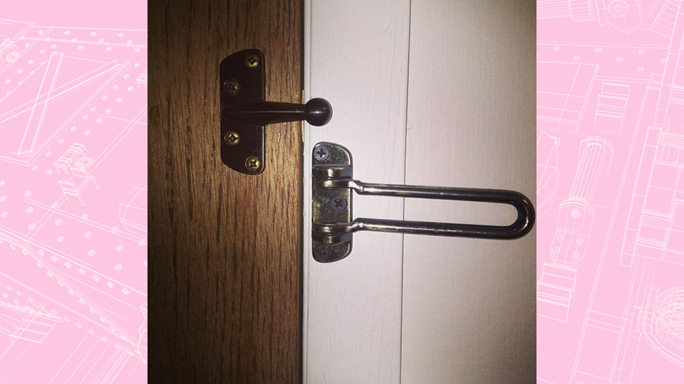
The Safety Guard door lock … that doesn’t!
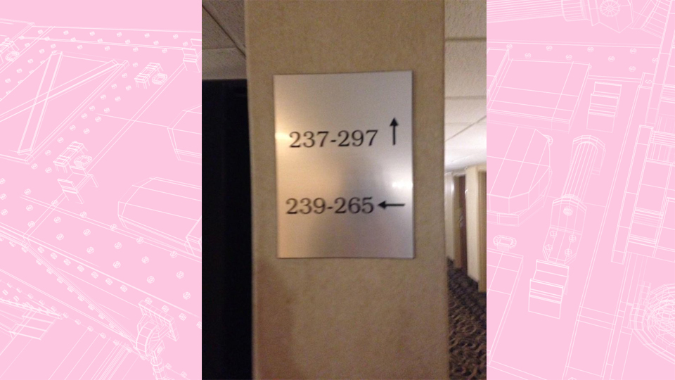
Room Signage … when you’re not sure if you’re going up, down or sideways!
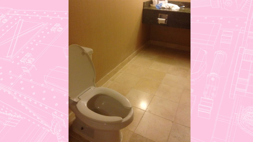
A good toilet design for Spiderman or Elastigirl. That’s one way to cut down on toilet paper usage
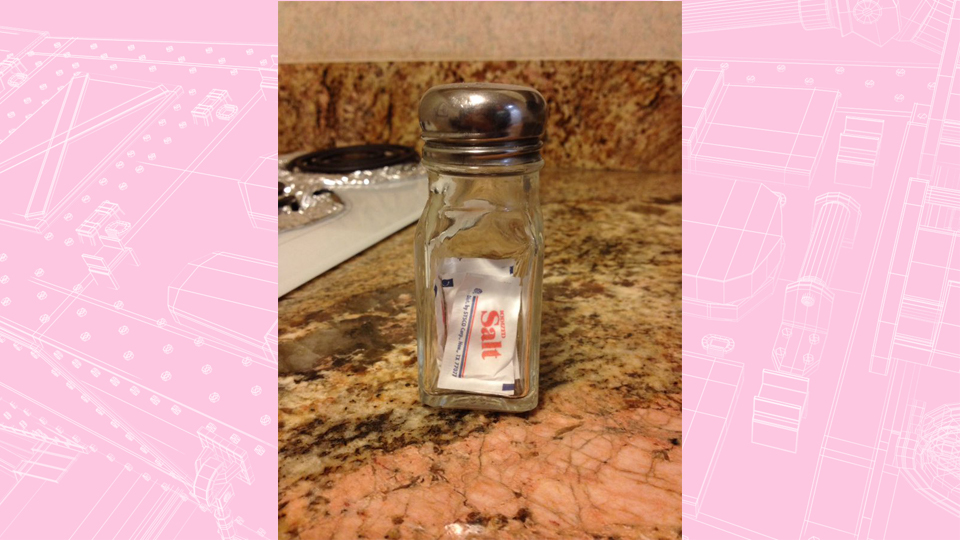
When a newbie is in charge of inventory and ordering in new stock! Well, technically, it does contain salt.
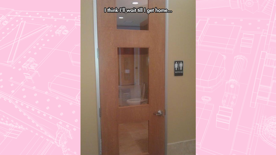
When a very private type of room … isn’t.
It’s not exactly the best place to put a glass accent on a door! Maybe it’s one-way glass but they installed it the wrong way round?
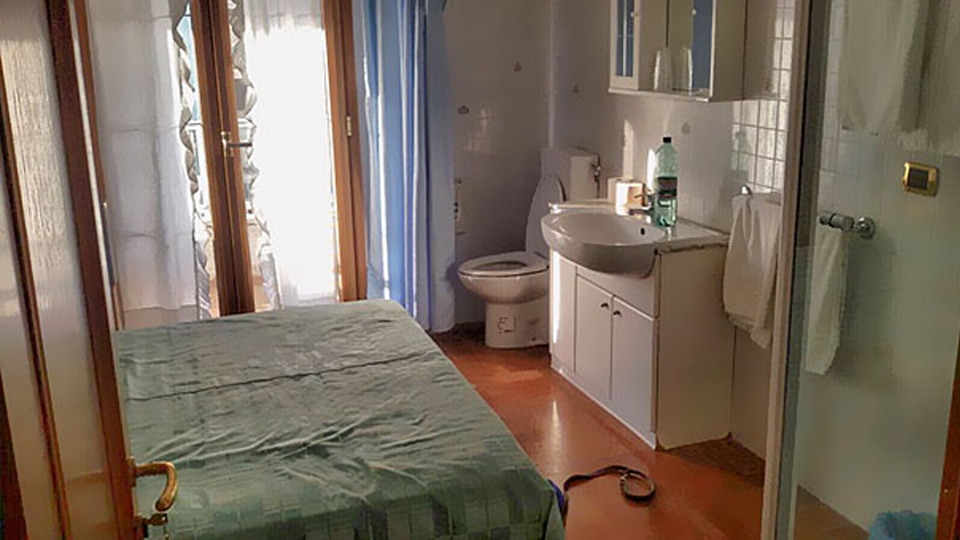
Taking “ensuite” to the next level! It’s certainly one way to maximize the available space!
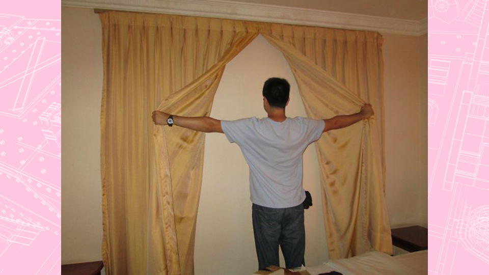
With this “window” and a little bit of imagination, you could be anywhere in the world!
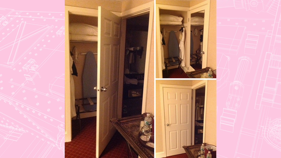
I’m not sure if this is ingenious or just cost-cutting! Why have two doors, when you can have one!
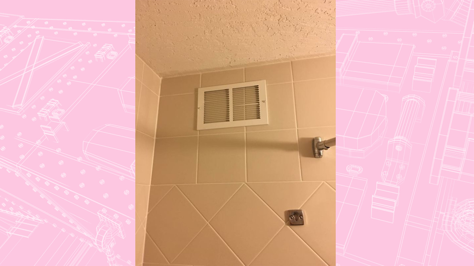
“Excuse me, Duty Manager? The vent in my bathroom does not seem to be working.”
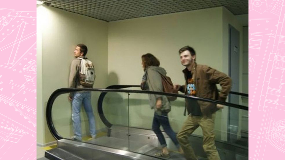
This escalator will help you get nowhere fast.
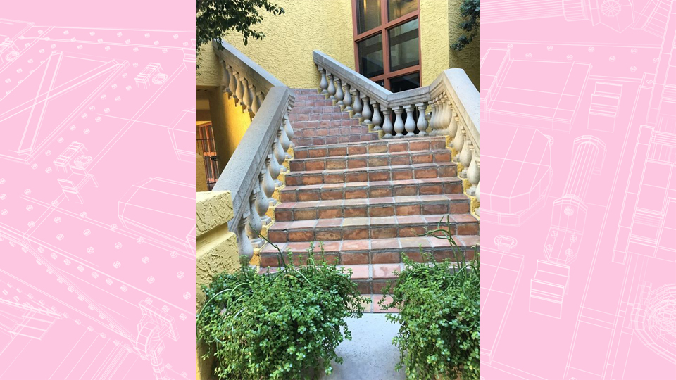
We don’t recommend trying to access Hogwarts from here!
An additional feature found in no other hotel. There has just been too many cases of people catching fire whilst showering!
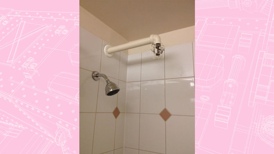
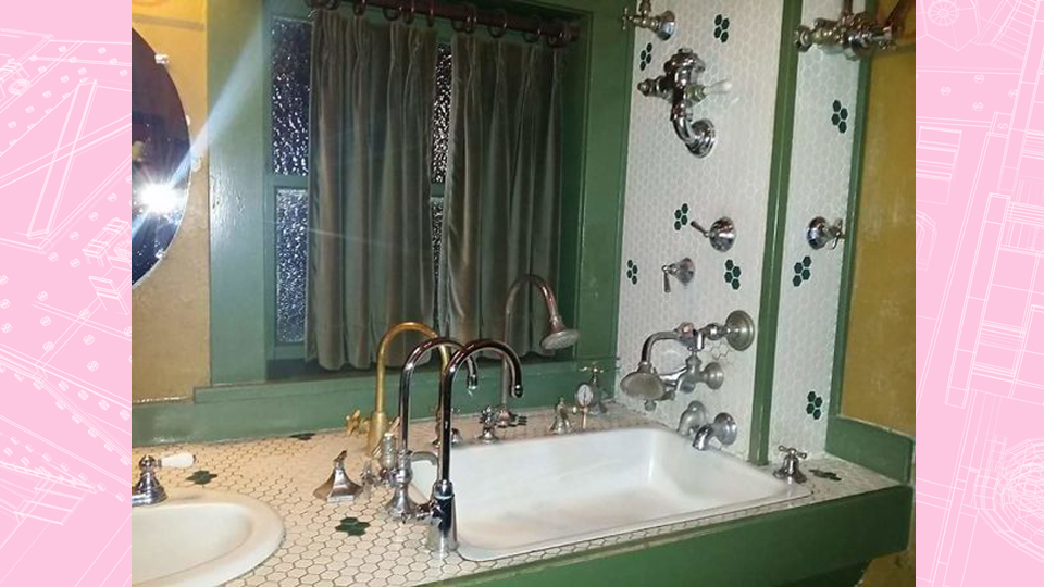
When the hotel is owned by a faucet enthusiast. Or another way to reduce water consumption. You can’t use it if you don’t know which tap to turn on!
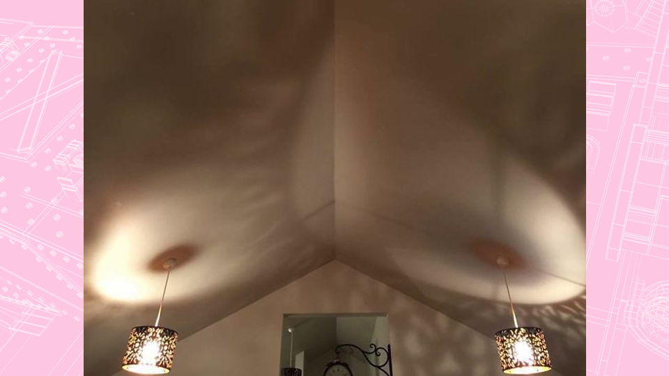
When the lamps make you feel a little bit uncomfortable. It’s difficult to tell if this was a deliberate or accidentally fail.
Finally, a sitting area just for Ninjas. Or was it done especially for a Parkour Convention?

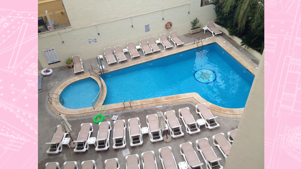
“Where are the kids?”
“They’re at the tip of the, um, pool.”
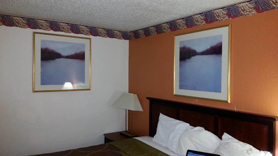
When the Interior Designers really love a certain picture.
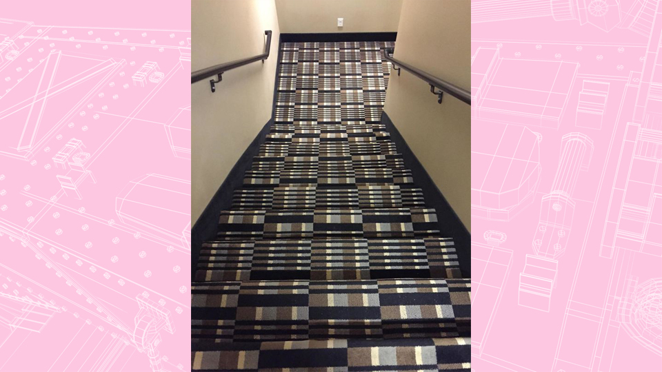
We hope you never use these stairs when you’re drunk!
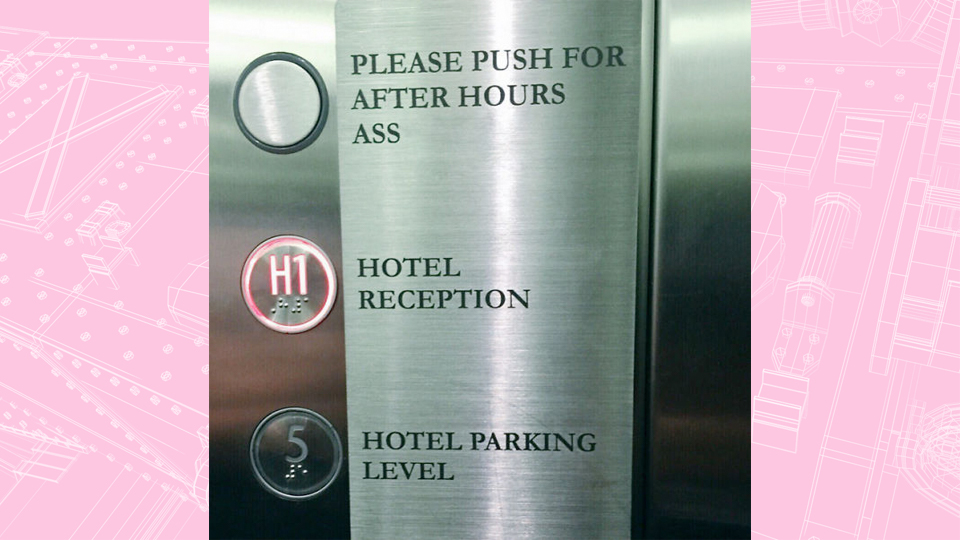
Not a good idea to abbreviate the word “Assistance” on this one!
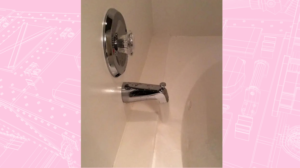
I’m sorry, what?
Maybe it’s intentional and they wanted to create waterfall features in their rooms?
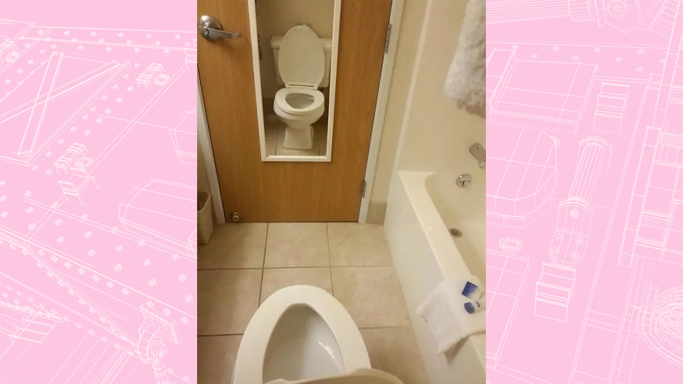
Because sometimes, we just want to sit there and watch ourselves do our business.
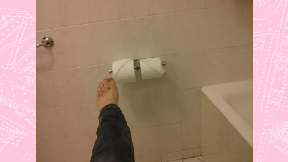
Another hotel trying to save on toilet paper!
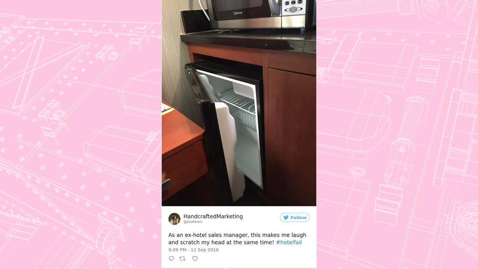
If you want us to go on a diet, you can just say so.
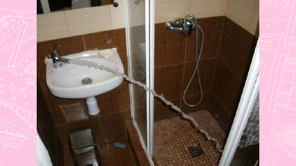
Five Stars for the excellent water pressure!
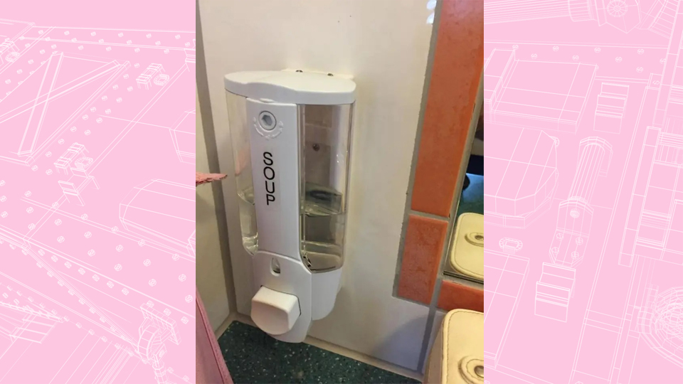
“Especially for those who always get hungry when showering”
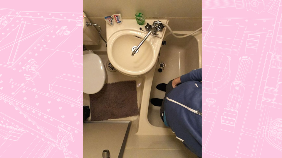
When the room description states “modern compact bathroom”
Coming face to face with hotel design faults like these can result in one of three responses. Depending on your mood, who you are traveling with and whether you had a great journey getting there, these epic fails can either send you over the edge, make you furious or make you laugh.
Either way, it makes for a memorable stay and a funny travel story!
Even if it takes you a few years before you find it funny!
Have you seen any crazy hotel design fails in your recent travels? Tell us in the comments!


